There is little doubt that the power of images in this industry cannot be undersold. Images of big fish, and beautiful landscapes drive shares and comments across all social media platforms. But can we do better?
Visual content has become extremely important in driving social engagement and has changed the way we market online.This last week I found two very interesting studies that illustrate the power of color choice and filter selection when creating visual content for online use.
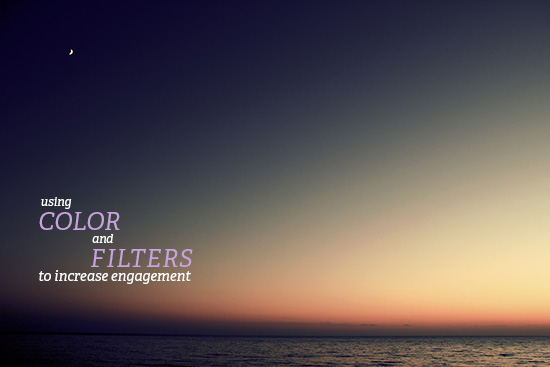
The effects of photo filters on online engagement.
You can’t take a photo on the camera app of your choice without being offered the opportunity to apply a filter. Instagram is the example most of us are familiar with. But can these filters really improve the level of sharing for any given photo? Yahoo, the owners of Flickr tried to answer that very question. They shared their findings in a recent tumblr post.
“Looking at 7.6 million public Flickr app photos modeled in a negative binomial regression, we found that filters boost engagement on the site. Filtered photos are 21% more likely to be viewed and 45% more likely to be commented on.”
Those numbers seem crazy to me. Generally speaking, a filtered photo tends to look more interesting than a straight out of the camera photo for the vast majority of us who aren’t professional photographers. One would assume you would get more interaction with a better looking photo, but 45% more likely to get comments. WOW!! I think this cuts to an underlying truth about online photography-
Great looking photos = More shares.
They also found that warmer color effects tend to increase sharing while cooler effects tend to slow sharing. Which leads into the next article I wanted to share this week.
A recent study from Georgia Tech looked at over 1,000,000 Pinterest images and found that Red, Purple and Pink tend to increase shares while Green, Black, Blue and Yellow all stop people from sharing.
The study went on to show that Red, Purple, and Pink illicit carnal emotions like lust, failure, love that we are more likely to respond to. They study also found that:
High Saturation drives sharing
We found that a strong positive correlation exists between an image’s saturation and its degree of diffusion. Previous research has shown that highly saturated colors can be more exciting as well as more widely liked.
So if we take the findings from these two studies and mash them up we find that filtered images with high saturation, warmer colors, and red, pink, or purple tones should help us get more shares online.


